
Home design trends come and go, but every few years a color palette emerges that feels timeless rather than trendy. This year, the biggest shift in interior design is the rise of Quiet Luxury—a decorating style that focuses on understated elegance, natural materials, calming colors, and spaces that feel effortlessly sophisticated instead of flashy.
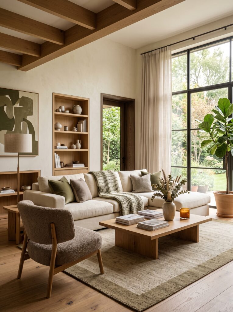
Unlike the all-white interiors that dominated the past decade or the bold maximalist trends that briefly took over social media, the new quiet luxury color palette is warmer, richer, and more inviting. It creates homes that feel peaceful, expensive, and lived in while maintaining a refined, designer-inspired aesthetic.
From luxury apartments in New York to modern homes in California and cozy cottages across the United States, this color palette is becoming the foundation of today’s most beautiful interiors. The best part is that you don’t need a complete renovation to embrace the look. A few thoughtful color choices can completely transform your home.
What Is the Quiet Luxury Color Palette?
Quiet luxury is built around subtle, nature-inspired tones that work together harmoniously. Instead of using bright colors to make a statement, this style relies on depth, texture, and balance.
The goal is to create rooms that feel calm from the moment you walk in. Every shade complements the others, allowing furniture, lighting, and natural materials to become the stars of the space.
Rather than chasing seasonal trends, quiet luxury embraces timeless colors that will still look beautiful years from now.
The Colors Defining Quiet Luxury Homes
Warm Ivory
Warm ivory replaces bright white as the new favorite neutral. It reflects natural light beautifully while making a room feel softer and more welcoming.
Use warm ivory on walls, ceilings, or upholstered furniture to create a clean yet cozy backdrop.
Mushroom Taupe
This sophisticated blend of beige and gray has become one of the most popular designer colors. Mushroom taupe adds depth without making a room feel dark.
It pairs beautifully with oak wood, linen fabrics, and natural stone finishes.
Soft Greige
Greige combines the warmth of beige with the elegance of gray, making it one of the most versatile colors for modern homes.
It’s perfect for open-concept spaces because it creates flow between rooms while maintaining a luxurious feel.
Sand Beige
Inspired by natural landscapes, sand beige introduces warmth and comfort without overwhelming a space.
This shade works exceptionally well in living rooms, bedrooms, and entryways where a relaxed atmosphere is desired.
Olive Green
Quiet luxury homes often include muted olive green as an accent color.
Whether used through painted cabinetry, decorative pillows, artwork, or indoor plants, olive green brings nature indoors while adding richness to the overall palette.
Clay and Terracotta
Instead of bright orange tones, designers are embracing soft clay-inspired hues that create warmth and character.
These earthy colors look stunning in ceramic decor, planters, accent chairs, and handmade pottery.
Charcoal Accents
Every neutral palette needs contrast.
Charcoal adds definition through lighting fixtures, picture frames, hardware, or furniture legs without overpowering the room.
A small amount of charcoal instantly creates a polished designer look.
Why This Palette Feels More Expensive
Luxury isn’t created by color alone. It’s the relationship between color, texture, and light.
Quiet luxury colors allow premium materials like oak, walnut, marble, travertine, linen, boucle, wool, and brushed brass to stand out naturally.
Instead of competing for attention, each element works together to create harmony.
This balanced approach is why boutique hotels, luxury resorts, and professionally designed homes often feel relaxing the moment you enter.
The colors don’t demand attention—they quietly elevate the entire experience.
The Importance of Natural Light
Natural light plays a huge role in bringing quiet luxury colors to life.
Morning sunlight enhances creamy whites and soft beiges, while afternoon light highlights the richness of taupe, olive, and warm wood tones.
To maximize natural light:
- Choose sheer or linen curtains.
- Keep windows uncluttered.
- Use mirrors to reflect daylight.
- Select matte finishes instead of overly glossy surfaces.
- Layer warm lighting for evenings.
The combination of natural daylight and warm ambient lighting creates a home that feels inviting at every hour.
Best Materials to Pair With Quiet Luxury Colors
The right materials make this palette feel authentic and timeless.
Popular designer choices include:
- Light oak furniture
- Walnut wood accents
- Travertine coffee tables
- Marble countertops
- Limestone decor
- Linen curtains
- Bouclé seating
- Wool area rugs
- Cotton bedding
- Handmade ceramics
- Woven baskets
- Brushed brass hardware
- Matte black fixtures
These materials add texture and character while reinforcing the understated elegance of quiet luxury.
How to Use the Palette in Every Room
Living Room
Start with warm ivory or greige walls. Add a cream sofa, an oak coffee table, a textured wool rug, and olive green accents through cushions or plants. Layer lighting with table lamps and floor lamps for a cozy atmosphere.
Kitchen
Choose warm white cabinetry paired with natural oak shelving and a stone backsplash. Introduce brass hardware and soft pendant lighting to create a welcoming, upscale look.
Bedroom
Create a peaceful retreat using ivory bedding, sand-colored throws, mushroom taupe walls, and linen curtains. Wooden nightstands and ceramic lamps complete the luxurious feel.
Bathroom
Replace bright white accessories with stone trays, wooden stools, fluffy cream towels, and eucalyptus greenery. Add candles or warm lighting for a spa-inspired atmosphere.
Entryway
A light oak console table, oversized mirror, neutral runner rug, and a ceramic vase with fresh greenery create a sophisticated first impression.
Decorating Tips That Bring the Palette to Life
Color alone isn’t enough. Quiet luxury homes feel complete because every element is intentional.
Focus on:
- Keeping surfaces uncluttered.
- Choosing fewer but higher-quality decor pieces.
- Mixing smooth and textured finishes.
- Incorporating natural materials.
- Adding greenery for freshness.
- Layering textiles such as linen, wool, and cotton.
- Using warm lighting instead of cool white bulbs.
- Displaying oversized artwork rather than multiple small frames.
These small styling choices transform a simple neutral room into a space that feels custom-designed.
Common Mistakes to Avoid
Many homeowners misunderstand quiet luxury by making interiors feel flat or lifeless.
Avoid these common mistakes:
- Using only one shade of beige throughout the room.
- Choosing cold gray instead of warm neutrals.
- Overdecorating shelves with too many accessories.
- Ignoring texture and relying only on color.
- Using harsh daylight bulbs instead of warm lighting.
- Buying matching furniture sets instead of mixing natural materials.
- Forgetting to include greenery and organic elements.
Balance is what makes quiet luxury feel elevated rather than boring.
Budget-Friendly Ways to Achieve the Look
You don’t need to replace everything at once. Small updates can have a big impact.
Paint walls in a warm neutral tone, replace synthetic curtains with linen panels, add textured cushions, upgrade cabinet hardware, introduce woven baskets for storage, style shelves with handmade ceramics, and invest in one statement piece such as a travertine side table or oversized mirror.
These simple changes create the feeling of a professionally designed home without exceeding your budget.
Conclusion
The new quiet luxury color palette is more than just a trend—it’s a timeless approach to creating homes that feel calm, elegant, and effortlessly beautiful. By embracing warm neutrals, earthy accents, natural materials, and layered textures, you can transform any room into a sophisticated space that never feels outdated.
Whether you’re refreshing a single corner or redesigning your entire home, these colors provide the perfect foundation for a welcoming interior that reflects modern luxury. Instead of chasing bold trends that quickly fade, invest in shades inspired by nature and timeless design. Your home will not only look more expensive but also become a place where comfort, style, and serenity come together beautifully.
- Outdoor Patio Ideas for a Cozy Late-Summer to Fall Transition
- Laundry Room Organization Ideas That Look Beautiful and Built-In
- Staircase Wall Decor Ideas: How to Create a Collected Gallery Look
- Library-Inspired Home Office Ideas That Make Working From Home Feel Luxurious
- Chocolate Brown Dining Table Ideas for a Warm and Elegant Fall Home