
Neutral interiors have dominated home decor for years, and for good reason. Cream walls, warm beige furniture, natural wood, soft linen, and earthy textures create a calm and timeless environment. But if your neutral home has started feeling a little too predictable, there is an easy way to give it personality without completely changing your decorating style: add a small touch of red.
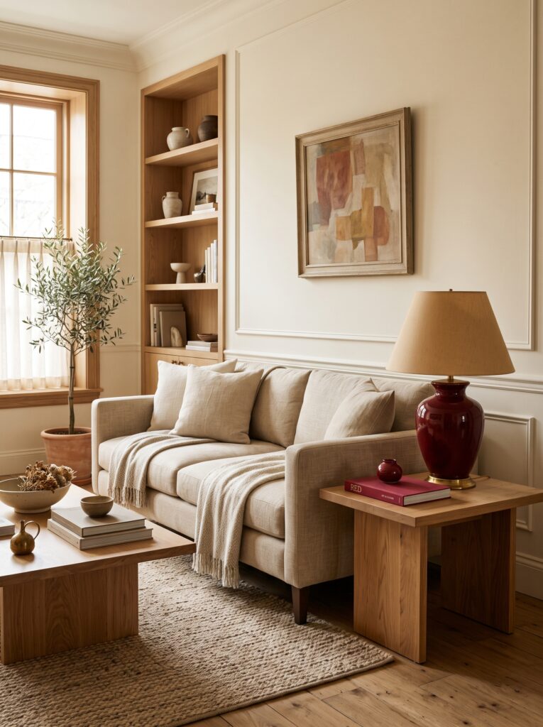
The idea behind unexpected red decor is simple. Instead of decorating an entire room in red, introduce one or two carefully selected red accents into an otherwise neutral space. A vintage red lamp, small lacquered table, decorative book, artwork, ceramic object, cushion, or even a tiny red accessory can create enough contrast to make the entire room feel more intentional.
This approach works particularly well for homeowners who love minimalist, organic, quiet-luxury, traditional, or neutral interiors but want something more expressive.
The secret is not using more red.
The secret is using just enough red to make people notice it.
What Is Unexpected Red Decor?
Unexpected red is an interior styling technique where a small amount of red is introduced into a room that doesn’t otherwise contain much strong color.
The red element becomes a visual surprise.
Imagine a room filled with:
- Warm ivory walls
- Cream upholstery
- Natural oak furniture
- Beige linen curtains
- Vintage artwork
- Soft brown accents
Now imagine adding one deep red table lamp.
Suddenly, the entire room feels more interesting.
The red doesn’t need to dominate the space. In fact, it works best when it appears almost unexpectedly.
This is what makes the concept so useful for modern home decorating.
You can experiment with color without committing to a dramatic makeover.
Why Red Works So Well in Neutral Interiors
Red has a naturally strong visual presence.
Compared with beige, cream, taupe, or soft brown, red immediately attracts attention.
That makes it useful for creating a focal point.
But red doesn’t always have to feel loud.
The right shade can feel sophisticated and collected.
For an elevated interior, consider shades such as:
- Burgundy
- Oxblood
- Brick red
- Terracotta red
- Muted cranberry
- Wine red
- Rust
- Deep cherry
- Warm red
These shades often blend more naturally with wood, brass, cream, and earthy neutrals than extremely bright primary red.
The Best Way to Use Unexpected Red
The biggest mistake is adding too many red accessories at once.
If you add a red sofa, red curtains, red rug, red pillows, and red artwork simultaneously, the effect is no longer “unexpected.”
Instead, choose one major red element or several extremely small accents.
Think of red as punctuation.
Your neutral room is the sentence.
Red is the exclamation point.
1. Try a Red Table Lamp
A red lamp can be one of the easiest ways to experiment with this trend.
Place it on:
- A nightstand
- Console table
- Side table
- Desk
- Bookshelf
- Entryway cabinet
A glossy lacquered lamp creates a slightly more dramatic appearance, while a vintage ceramic lamp can create a softer, collected look.
Pair the lamp with neutral furniture and allow it to become the focal point.
2. Add a Small Red Side Table
If you want something more noticeable, a small accent table can introduce color without overwhelming the room.
A vintage side table painted in deep red can look particularly beautiful against:
- Cream walls
- Beige sofas
- Natural wood floors
- Linen upholstery
- Neutral rugs
The contrast creates personality while maintaining an elegant overall aesthetic.
3. Use Red Artwork
Artwork is one of the safest ways to introduce unexpected color.
Look for artwork that contains a small amount of red rather than an entirely red composition.
For example, an abstract painting might contain cream, brown, black, and a small red shape.
That tiny red detail can then be repeated elsewhere in the room through a book, ceramic object, or textile.
This creates cohesion without making the color feel forced.
4. Introduce Red Through Books
Decorative books are another low-commitment way to experiment with the trend.
A deep red hardcover book placed on a coffee table, bookshelf, or console can create a surprisingly sophisticated accent.
You can stack it beneath a ceramic vase or sculpture.
This is especially effective when the room already contains warm brown, cream, black, or natural wood tones.
5. Try a Red Ceramic Piece
Handmade pottery can make red feel much softer.
Instead of a glossy bright-red accessory, consider:
- Deep red ceramic vase
- Brick-red bowl
- Burgundy pottery
- Rust-colored candleholder
- Dark red sculptural object
The imperfect texture of handmade ceramics can make the color feel more organic.
6. Add a Single Red Pillow
If you’re not ready to commit to furniture or accessories, try one pillow.
One red pillow placed among cream, beige, taupe, and brown pillows can create a beautiful contrast.
You don’t necessarily need a perfectly matching pair.
In fact, one unexpected pillow can feel more sophisticated.
7. Use Red in the Dining Room
Dining rooms are excellent spaces for experimenting with color.
A dark red vintage dining chair can instantly transform an otherwise neutral dining area.
Alternatively, use:
- Red candlesticks
- Red napkins
- Red ceramic plates
- A small red vase
- Artwork containing red
Keep the rest of the room relatively calm.
This allows the accent to stand out.
8. Create an Unexpected Red Entryway
Your entryway is the first impression of your home.
Instead of decorating it with the same neutral accessories everyone else uses, introduce one unexpected red detail.
For example:
A narrow console table + oversized mirror + ceramic vase + deep red lamp.
The effect can be dramatic without requiring a major renovation.
9. Use Red in the Kitchen
Kitchen decor doesn’t always have to be white, black, or natural wood.
A small red accent can make a neutral kitchen feel more collected.
Consider:
- Vintage red stool
- Red ceramic bowl
- Red cookbook
- Small red lamp
- Red artwork
- Red kitchen towel
- Decorative red container
The key is keeping the accent intentional.
Avoid scattering tiny red accessories everywhere.
10. Unexpected Red in a Home Office
A home office can benefit from a stronger accent color because it creates energy and personality.
Try a red desk lamp or vintage chair.
Pair it with:
- Warm wood
- Cream walls
- Natural linen
- Neutral shelving
- Black metal accents
This combination can feel sophisticated while still giving the room character.
Choosing the Right Shade of Red
Not every red will produce the same effect.
Burgundy
Elegant and sophisticated.
Works well with:
- Walnut
- Cream
- Brass
- Dark green
- Beige
Oxblood
Deep and dramatic.
Excellent for:
- Traditional interiors
- Old-world inspired spaces
- Library-style rooms
- Moody home offices
Brick Red
Warm and earthy.
Works beautifully with:
- Terracotta
- Natural wood
- Cream
- Beige
- Olive green
Cherry Red
More playful and energetic.
Best when used in very small amounts.
Rust
Soft and organic.
Excellent for:
- Bohemian interiors
- Organic modern homes
- Southwestern-inspired spaces
- Warm neutral palettes
Unexpected Red + Quiet Luxury
At first glance, red and quiet luxury might seem like opposite concepts.
But they can work beautifully together.
Quiet luxury interiors often depend on:
- Quality-looking materials
- Restrained color palettes
- Natural textures
- Classic silhouettes
- Thoughtful accessories
Adding one deep red object doesn’t destroy that aesthetic.
Instead, it can make the room feel more personal.
For example:
Cream linen sofa + walnut coffee table + vintage artwork + brass lamp + one oxblood ceramic vase.
The room remains sophisticated, but the red gives it personality.
Unexpected Red + Vintage Decor
Red has a natural relationship with vintage interiors.
Think about old European homes, traditional libraries, antique furniture, vintage textiles, and classic artwork.
A deep red object can make contemporary rooms feel slightly more collected.
Try pairing:
Modern sofa + vintage red lamp
or
Modern console + antique red ceramic
or
Contemporary dining table + vintage red chair
The contrast creates visual tension.
And visual tension is often what makes a room memorable.
How Much Red Is Too Much?
There isn’t a strict mathematical rule, but a useful approach is to keep red relatively limited.
For a neutral room, start with:
One major red piece
or
Two to three very small red accents.
Then step back and evaluate.
If your eye immediately travels toward the red and stays there, you may have enough.
If the entire room starts feeling like a red-themed space, reduce the number of accents.
Remember that unexpected red works because it is unexpected.
How to Combine Red With Other Colors
Red becomes easier to use when paired with the right neutrals.
Red + Cream
Soft and elegant.
Red + Walnut
Warm and sophisticated.
Red + Beige
Subtle and approachable.
Red + Olive Green
Earthy and collected.
Red + Black
Dramatic and contemporary.
Red + Brass
Warm and luxurious.
Red + Chocolate Brown
Rich and sophisticated.
Red + Soft Blue
Classic and slightly unexpected.
For an elevated home, warm neutrals such as cream, camel, walnut, taupe, and chocolate brown are particularly effective.
Affordable Ways to Try the Trend
You don’t need to buy expensive furniture.
Start small.
Shop your local:
- Thrift stores
- Estate sales
- Antique shops
- Vintage markets
- Secondhand furniture stores
- Local artisan markets
Look for one interesting red object.
It could be an old lamp, ceramic vase, picture frame, decorative box, side table, or piece of artwork.
Sometimes the most interesting red pieces are the ones that already have some age and character.
Don’t Buy Everything New
Before purchasing anything, look around your home.
You may already own something that can become your unexpected red accent.
Check:
- Storage closets
- Bookshelves
- Kitchen cabinets
- Old artwork
- Decorative boxes
- Textiles
- Lamps
- Vases
A forgotten piece can sometimes completely change when moved into a new room.
How to Photograph Unexpected Red Decor for Pinterest
If you’re using this idea for Pinterest content, the visual presentation matters enormously.
Create a composition where the red element is clearly visible but not dominating the entire image.
Use:
- Natural window light
- Warm neutral surroundings
- Strong texture
- Negative space
- One obvious focal point
- Vertical framing
- Minimal visual clutter
For example, photograph a cream living room with a single deep-red vintage lamp positioned on a walnut side table.
The contrast should be immediately visible even in a small Pinterest thumbnail.
Unexpected Red in Different Rooms
Living Room
Try a red lamp, pillow, artwork, or side table.
Bedroom
Use one red cushion, ceramic lamp, or artwork detail.
Dining Room
Experiment with a vintage red chair or tabletop accessories.
Kitchen
Use a red stool, bowl, or small decorative object.
Entryway
A red lamp or artwork can create an unforgettable first impression.
Home Office
A red desk chair or lamp can add energy.
Bathroom
A small red artwork or ceramic accessory can create contrast without overwhelming the space.
Common Mistakes With Unexpected Red
Using Too Many Red Accessories
The whole concept depends on restraint.
Choosing the Wrong Shade
Extremely bright red can feel harsh in some neutral interiors.
Ignoring the Existing Palette
Red should interact with the colors already present.
Making Everything Match
A perfectly coordinated red set can look overly intentional.
Decorating Only for Trends
Choose pieces you genuinely like.
Forgetting Texture
A flat red accessory can look different from textured vintage ceramic, velvet, wool, or aged wood.
The Bigger Lesson Behind the Trend
The real appeal of unexpected red isn’t simply the color itself.
It’s the decorating philosophy behind it.
Modern homes can sometimes become overly predictable.
Cream sofa.
Beige rug.
White walls.
Oak table.
Neutral artwork.
Everything looks beautiful—but sometimes nothing feels surprising.
A small dose of unexpected color introduces personality.
It tells visitors that the homeowner isn’t simply following a checklist.
They have made deliberate choices.
That’s what makes a home feel personal.
Conclusion
Unexpected red is a simple yet powerful way to give a neutral home more personality without completely changing its existing style. Instead of overwhelming a room with bold color, one carefully selected red accent can create contrast, depth, and visual interest while keeping the overall space elegant and sophisticated. Whether you choose a vintage lamp, ceramic vase, artwork, side table, decorative book, or single accent pillow, the key is restraint and thoughtful placement. When paired with warm neutrals, natural wood, brass, cream, beige, or rich brown, the right shade of red can make an ordinary interior feel more expressive and designer-inspired. Sometimes, one unexpected color is all a room needs to move from safe and predictable to memorable and beautifully curated.
- Moody Blue Room Ideas for a Sophisticated Cozy Home
- White Oak and Black Kitchen Ideas for a Modern Timeless Home
- The Garden Patio Ideas That Make Outdoor Spaces Feel Magical
- Dark Cottagecore Kitchen Ideas With Timeless Charm
- Warm Wood Kitchen Ideas That Make a Home Feel Instantly Expensive