
Choosing colors for your home can completely change the way a room looks and feels. The right color combination can make a small space feel more welcoming, give a plain room more personality, or make an ordinary interior look surprisingly sophisticated. While neutral interiors remain popular, many homeowners are now moving toward more expressive color palettes that feel warm, collected, and individual.
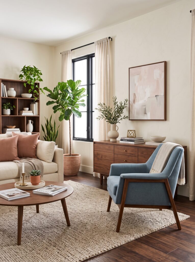
The good news is that you do not need to repaint your entire home to experiment with color. A thoughtfully selected combination of wall color, furniture, textiles, artwork, rugs, and accessories can create a designer-inspired interior without requiring a complete renovation.
If you have always decorated with beige, white, gray, or cream but feel that your home is missing personality, unexpected color combinations can be the perfect solution. The secret is not simply adding more color. It is choosing colors that complement one another while creating enough contrast to make the room visually interesting.
From dusty blue and warm walnut to olive green and blush, there are countless sophisticated color combinations that can make a home feel intentional, modern, and expensive.
Why Color Combinations Matter in Home Decor
Color is one of the first things people notice when they enter a room.
Before someone notices the exact shape of your coffee table or the material of your curtains, they are likely to experience the overall color palette of the space.
A successful color scheme creates visual harmony.
A poorly balanced palette can make a room feel disconnected, even when every individual piece is beautiful.
This is why professional-looking interiors often use a limited number of colors repeated throughout the room.
Instead of choosing ten different shades, designers often work with a primary color, a supporting color, and one or two smaller accent colors.
This creates consistency while still allowing the space to feel layered.
The 60-30-10 Rule for Decorating With Color
One simple way to understand color balance is the 60-30-10 approach.
Approximately 60 percent of the room can be your dominant color. This might appear on walls, large furniture, flooring, or major textiles.
Around 30 percent can be a secondary color. This could come from curtains, accent furniture, rugs, bedding, or cabinetry.
The final 10 percent can be an accent color used in smaller decorative details.
You do not have to follow these percentages literally.
The principle is simply to avoid allowing every color to compete for attention.
A sophisticated room usually has a visual hierarchy.
1. Dusty Blue + Warm Walnut + Cream
Dusty blue is a beautiful alternative to traditional gray or navy.
When paired with warm walnut wood and creamy white, it creates a sophisticated palette that feels both fresh and timeless.
The blue provides a subtle cool element while walnut adds warmth.
Cream brings the two together.
This combination works particularly well in:
- Living rooms
- Bedrooms
- Home offices
- Dining rooms
- Reading spaces
For a simple version, keep the walls cream and introduce dusty blue through an accent chair, artwork, pillows, or curtains.
Use walnut through furniture and small decorative details.
The result is elegant without feeling overly formal.
2. Olive Green + Blush Pink + Warm White
Olive green and blush pink might initially sound like an unusual pairing, but the combination can be surprisingly sophisticated when both shades are muted.
Avoid overly bright pink.
Instead, look for dusty rose, muted blush, or soft clay-pink tones.
Olive green can appear through:
- Accent chairs
- Curtains
- Plants
- Cabinets
- Artwork
- Decorative cushions
Blush can be introduced through smaller accessories.
Warm white acts as the neutral foundation.
This color combination is particularly beautiful for bedrooms because the palette can feel calming without becoming boring.
3. Butter Yellow + Soft White + Natural Wood
Soft yellow has become an appealing choice for homeowners who want warmth without using intense gold or bright primary yellow.
A muted butter-yellow shade can make a room feel cheerful and welcoming.
Pair it with warm white and natural wood to keep the look sophisticated.
This combination can work beautifully in kitchens, breakfast areas, dining rooms, and home offices.
You could use butter yellow on:
- Kitchen cabinetry
- A small accent wall
- Dining chairs
- Curtains
- Decorative ceramics
- Artwork
Natural wood prevents the yellow from feeling too sweet.
The overall result is warm, optimistic, and inviting.
4. Terracotta + Muted Pink + Cream
Terracotta has a natural earthy quality that works especially well with neutral interiors.
When combined with muted pink and cream, it creates a warm and slightly unexpected palette.
This combination is ideal for homeowners who want more personality while maintaining a soft aesthetic.
Try introducing terracotta through:
- Area rugs
- Throw pillows
- Ceramic pieces
- Artwork
- Accent chairs
- Decorative pottery
Muted pink can remain subtle.
Cream walls and furniture provide the visual breathing room needed to keep the palette sophisticated.
5. Deep Burgundy + Camel + Ivory
For a more dramatic interior, consider deep burgundy.
Rather than using a bright red, choose a dark wine-inspired shade.
Pair it with camel and ivory for a rich, layered palette.
This combination can work especially well in:
- Dining rooms
- Libraries
- Home offices
- Moody bedrooms
- Formal sitting areas
You don’t need much burgundy.
A single upholstered chair, artwork, cushion, or rug can be enough.
Camel introduces warmth while ivory prevents the room from feeling too dark.
6. Chocolate Brown + Soft Blue + Beige
Brown has become an increasingly attractive alternative to traditional gray for homeowners seeking warmer interiors.
Chocolate brown can create depth and sophistication.
Pairing it with soft blue introduces contrast.
Beige then balances the palette.
This combination works particularly well with natural materials such as:
- Linen
- Leather
- Wood
- Wool
- Stone
- Cotton
For a subtle approach, use chocolate brown furniture with beige walls and soft blue accessories.
The result can feel sophisticated without looking overly designed.
7. Sage Green + Warm Beige + Black
Sage green is one of the easiest colors to introduce into a neutral home.
Its muted quality makes it easier to combine with other shades.
Warm beige keeps the room soft, while small amounts of black provide definition.
Black works best as an accent rather than the dominant color.
Try using black through:
- Lighting fixtures
- Picture frames
- Furniture legs
- Curtain rods
- Hardware
- Small decorative objects
This combination works particularly well in modern, organic, transitional, and minimalist homes.
8. Navy + Warm White + Natural Oak
Navy can look sophisticated without making a room feel dark when used strategically.
Pair it with warm white and natural oak for a balanced palette.
This combination works particularly well in:
- Kitchens
- Dining rooms
- Bathrooms
- Home offices
- Bedrooms
For example, navy lower kitchen cabinets combined with warm white upper areas and natural oak accents can create a timeless appearance.
In a bedroom, navy can be introduced through bedding or an upholstered headboard.
9. Lavender Gray + Espresso Brown + Cream
For something less predictable, try a muted lavender-gray.
This shade can provide a subtle hint of color without feeling overly purple.
Pair it with espresso brown furniture and creamy textiles.
The darker brown grounds the cooler lavender tone.
This palette can be particularly attractive in bedrooms, reading corners, and sophisticated home offices.
Keep the accessories simple so the color combination remains the focus.
10. Charcoal + Warm Beige + Terracotta
Charcoal does not have to create a cold or industrial interior.
When paired with warm beige and terracotta, it can become incredibly inviting.
Use charcoal sparingly through:
- Accent furniture
- Window frames
- Artwork
- Lighting
- Decorative accessories
Warm beige should remain the dominant neutral.
Terracotta can add small touches of warmth.
This is a particularly effective strategy for contemporary homes where homeowners want contrast without using pure black.
How to Choose the Right Color Combination for Your Home
Before choosing a color palette, consider the existing elements in your room.
Look at:
- Flooring
- Cabinetry
- Countertops
- Furniture
- Natural lighting
- Window treatments
- Architectural features
If your home already has warm wood floors, extremely cool colors may create an uncomfortable contrast.
Instead, consider colors that visually connect with the warmth already present.
Similarly, if your room receives very little natural light, extremely dark colors throughout the space may make it feel smaller.
Use lighter neutrals as a foundation and introduce deeper colors through accents.
Consider Natural Light Before Choosing Paint
Natural light can dramatically affect how a color appears.
A color that looks soft and warm in a showroom may appear completely different inside your home.
North-facing rooms often receive cooler-looking light, while south-facing spaces tend to receive warmer natural light.
East- and west-facing rooms can also change significantly throughout the day.
Before committing to a paint color, test samples on the actual wall.
Look at them in the morning, afternoon, and evening.
This is especially important if you are choosing a strong or unusual color.
Use Color Through Decor Instead of Paint
You don’t have to repaint your home to experiment with a new palette.
This is especially useful for renters.
Try introducing color through:
- Throw pillows
- Blankets
- Curtains
- Area rugs
- Artwork
- Lamps
- Ceramics
- Bedding
- Accent chairs
- Dining chairs
- Decorative objects
This approach allows you to experiment without making a permanent change.
It also makes seasonal decorating much easier.
Create a Color Story Throughout Your Home
A sophisticated home does not necessarily use the exact same colors in every room.
Instead, create a visual connection.
For example, you could use warm beige throughout the house as the consistent neutral.
Then introduce dusty blue in the living room, muted green in the kitchen, and soft terracotta in the bedroom.
The rooms remain individual while still feeling connected.
You can also repeat small elements.
If you have brass lighting in one room, introduce small brass details elsewhere.
If walnut furniture appears in your living room, use a smaller walnut accent in the dining area.
These subtle repetitions create continuity.
Don’t Forget the Ceiling
The ceiling is often ignored when decorating with color.
But it can become an unexpected design element.
Instead of automatically choosing bright white, consider a softer version of your wall color.
For example, a pale warm beige ceiling can create a cozy atmosphere.
A subtle blue ceiling can make a bedroom feel more distinctive.
In a dining room, a slightly deeper ceiling color can create a dramatic effect.
The key is keeping the color intentional.
Use Artwork to Introduce Multiple Colors
Artwork is one of the easiest ways to combine several colors without making a room feel chaotic.
Choose one piece that contains two or three colors already present in the room.
For example, if your room features cream, walnut, and dusty blue, select artwork containing those same tones.
This visually connects the different elements.
It can also help you discover new accent colors.
You may notice that your artwork contains a small amount of rust or muted green.
That tiny color can then be repeated through a cushion or ceramic accessory.
Color Doesn’t Have to Mean Maximalism
Adding color does not automatically mean creating a maximalist interior.
You can have a minimalist home with a sophisticated color palette.
The secret is controlling the number of colors and maintaining visual breathing room.
A cream room with one dusty-blue chair and a few matching accessories can still feel minimalist.
Likewise, a neutral bedroom with muted green bedding can have plenty of personality without becoming visually busy.
Color should support the room rather than overwhelm it.
Common Home Color Mistakes to Avoid
One common mistake is choosing too many unrelated colors.
Another is using every color with the same intensity.
For example, bright yellow, bright pink, bright blue, and bright green competing in one small room can quickly become overwhelming.
Instead, choose one stronger shade and surround it with softer colors.
Another mistake is ignoring undertones.
Two beige shades can look completely different if one has pink undertones and another has yellow undertones.
The same is true for whites, grays, greens, and blues.
Always compare colors in the actual room before making a final decision.
How to Make Color Look More Expensive
Sophisticated color schemes often depend on restraint.
Instead of buying many colorful accessories, choose a few pieces with strong visual impact.
Repeat colors in different materials.
For example, if you choose terracotta, use it in both a ceramic vase and a textile.
This creates depth.
You can also vary the texture.
A single color can appear in:
- Velvet
- Linen
- Ceramic
- Wood
- Wool
- Glass
Different textures prevent a monochromatic palette from feeling flat.
Create Contrast With Materials
Color becomes even more interesting when combined with contrasting materials.
Imagine a muted green wall with warm wood furniture and brushed metal lighting.
Or picture dusty blue textiles against a cream Boulez chair and walnut table.
The colors become more dimensional because the materials reflect and absorb light differently.
This is one reason designer interiors rarely rely on color alone.
Texture and material are equally important.
Affordable Ways to Test a New Color Palette
If you are unsure about committing to a new color, start small.
Purchase inexpensive pillow covers rather than an entire sofa.
Try removable artwork instead of repainting.
Use a small rug before investing in a large one.
Introduce a colorful vase or lamp.
Live with the combination for a few weeks.
If you still love it, you can gradually introduce more of the color.
This approach reduces the risk of expensive decorating mistakes.
Conclusion
The most beautiful home color combinations are not always the obvious ones. Sometimes the most sophisticated interiors come from unexpected pairings that create contrast while still maintaining balance.
Dusty blue with walnut, olive with blush, butter yellow with natural wood, terracotta with muted pink, burgundy with camel, or chocolate brown with soft blue can all create memorable interiors when used thoughtfully.
The key is not simply following a color trend. Choose shades that work with your home’s natural light, existing finishes, furniture, and overall atmosphere. Start with a dominant neutral, introduce a supporting color, and use a stronger shade sparingly for visual interest.
If you’re tired of predictable beige-and-white interiors, don’t be afraid to experiment. A carefully chosen color combination can completely change the personality of your home without requiring a major renovation.
Sometimes all a room needs is one unexpected color relationship to make everything else look more intentional, elevated, and beautifully designed.
- Afrohemian Dining Room Ideas for a Warm, Collected and Sophisticated Home
- Warm Wood and Black Kitchen Ideas for a Timeless Designer Look
- Small Reading Nook Ideas That Turn Forgotten Corners Into a Cozy Luxury Retreat
- Curated Trinket Shelf Ideas: How to Create a Collected and Personal Home
- Neo Deco Entryway Ideas That Make Your Home Feel Instantly Expensive