
There is something undeniably beautiful about a room that feels completely wrapped in color. Instead of choosing one paint color for the walls and then using white trim, doors, and ceilings as a contrast, color drenching takes a much more immersive approach. The walls, trim, doors, and sometimes even the ceiling are treated as part of one continuous color story.
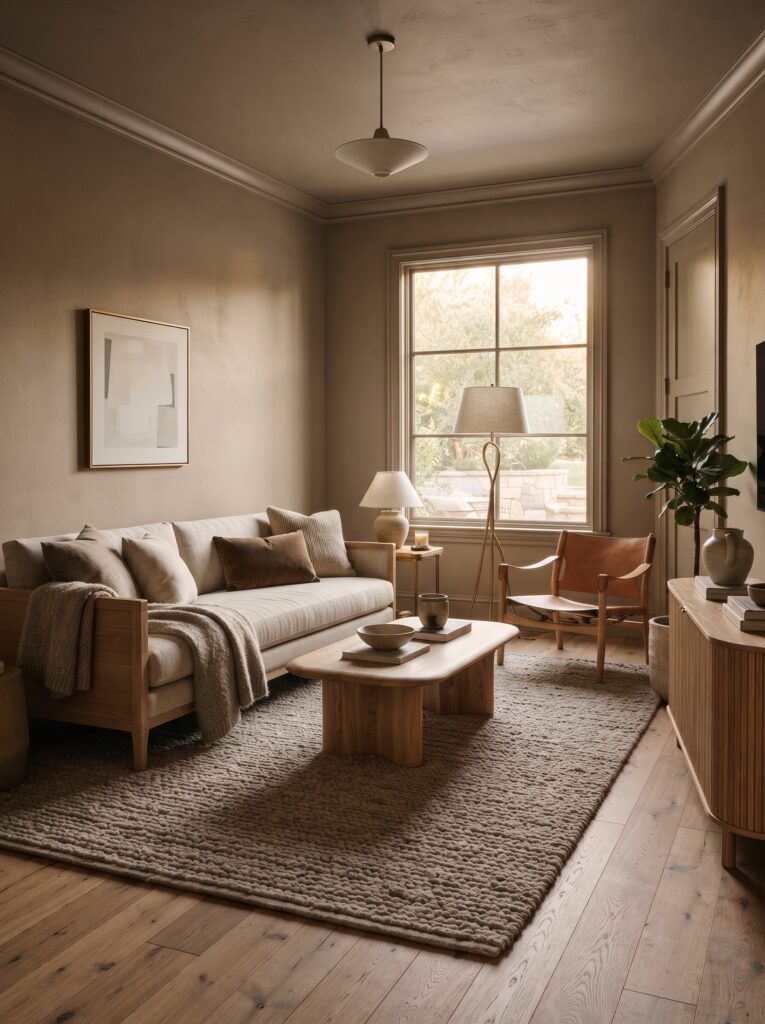
The result can be dramatic, cozy, sophisticated, or surprisingly calming depending on the shade you choose.
Color drenching has become especially interesting for homeowners who want their interiors to feel more personal and expressive rather than overly neutral. Pinterest’s 2026 trend reporting points toward a stronger interest in self-expression, bold color, vintage influences, and small-scale home transformations rather than waiting for a massive renovation. Searches around color drenching have also been highlighted in Pinterest’s home trend data.
For homeowners in the United States looking for an easy way to make a room feel more intentional, color drenching can be one of the most effective decorating techniques to explore.
What Is Color Drenching?
Color drenching means using essentially one color throughout multiple architectural surfaces in a room.
Instead of having:
- colored walls
- white baseboards
- white doors
- white window trim
- a contrasting ceiling
you use variations of the same color—or the same paint color—across most of those surfaces.
This creates visual continuity.
The technique can be used with almost any color. Soft beige can create a warm and sophisticated room, while deep blue can create a dramatic atmosphere. Olive green can feel organic and relaxed, while plum or burgundy can create a richer, more intimate environment.
The important part is not simply choosing a bold color. The magic comes from allowing the color to move throughout the architecture.
Why Color Drenching Works So Well
One reason color drenching feels so sophisticated is that it reduces visual interruptions.
Traditional rooms often have multiple contrasting elements: white trim against colored walls, a different ceiling color, contrasting doors, and several furniture finishes. Each contrast creates a visual stopping point.
When those surfaces are brought into a similar color family, the eye moves more smoothly around the room.
This can make architectural features feel more integrated and can give an ordinary space a much stronger sense of identity.
It can also make small rooms feel surprisingly intentional. Rather than trying to make every small space look larger through white paint, color drenching allows you to embrace the room’s proportions and turn them into part of the design.
Choosing the Right Color for Your Home
The biggest decision is obviously the color.
However, choosing a color for a color-drenched room is different from choosing an accent color.
You are going to see much more of it.
That means a shade that looks beautiful on a small paint sample may feel completely different when it covers four walls, trim, doors, and potentially a ceiling.
Warm Earthy Neutrals
Warm neutrals are one of the easiest ways to experiment with this technique.
Think:
- mushroom
- warm taupe
- almond
- caramel beige
- soft clay
- creamy brown
- muted sand
These colors create a sophisticated backdrop without feeling overwhelming.
Current interior-design coverage has also pointed toward warmer earth tones and layered, tactile spaces rather than sterile cool-gray interiors.
For an American home, warm neutral color drenching can work beautifully in bedrooms, offices, dining spaces, hallways, and cozy sitting rooms.
Moody Blue
Blue can completely change the mood of a room.
A soft dusty blue creates an airy atmosphere, while a deep navy or blue-green can feel dramatic and intimate.
Pinterest’s 2026 color reporting identifies Cool Blue as one of its forecast colors, reflecting continued interest in expressive blue tones.
For a sophisticated result, combine blue walls and trim with:
- natural wood
- cream upholstery
- aged brass
- linen
- warm lighting
This prevents the room from feeling too cold.
Rich Plum
Plum is another interesting option for homeowners who want something more distinctive.
Pinterest’s 2026 palette includes Plum Noir, and color-drenching is specifically discussed as one way to use stronger colors throughout an interior.
A muted plum room can feel luxurious without looking overly formal.
Pair it with warm ivory, antique-inspired furniture, natural wood, and soft lighting for an elegant effect.
Soft Green
Muted green is especially useful when you want a room to feel connected to nature.
Consider:
- sage
- moss
- olive
- eucalyptus
- muted jade
Pinterest’s 2026 palette also includes Jade, described by Pinterest as a green positioned between mint and moss.
Green works particularly well with wood, woven textures, stone, linen, and plants.
Should the Ceiling Be Painted Too?
This is one of the biggest questions homeowners have about color drenching.
The answer depends on the effect you want.
Painting the ceiling the same color can create a beautifully enveloping atmosphere. In a bedroom or intimate sitting room, this can make the space feel cozy and sophisticated.
If painting the entire ceiling feels too dramatic, you can begin with:
- walls
- baseboards
- door trim
- doors
and leave the ceiling lighter.
However, if your goal is a true color-drenched interior, carrying the color onto the ceiling creates the strongest visual effect.
Don’t Forget the Trim
White trim is often the first thing that breaks a color-drenched look.
If you are committing to the technique, consider painting:
- baseboards
- crown molding
- door frames
- window trim
- interior doors
in the same color family.
This doesn’t necessarily mean every surface must have exactly the same sheen.
You can use different finishes to create subtle variation while maintaining visual continuity.
For example, walls can have an eggshell finish while trim and doors use a slightly more durable satin finish.
How to Make a Color-Drenched Room Feel Elegant
Color alone does not create a luxurious room.
The furniture and materials surrounding the color are equally important.
A room covered in a beautiful shade can still feel flat if everything inside it is inexpensive-looking or visually repetitive.
Instead, layer different textures.
Try combining:
- linen
- velvet
- natural wood
- woven baskets
- stone
- ceramic
- aged brass
- boucle
- textured rugs
The contrast between materials gives the monochromatic color scheme more depth.
This is particularly important because current 2026 interior trends are leaning toward tactile, personal, layered environments rather than perfectly matched showroom interiors.
Use Lighting to Change the Mood
Lighting becomes extremely important in a color-drenched room.
Natural daylight will reveal the undertones of your paint color during the day, while warm artificial lighting can make the same color appear deeper and richer at night.
Instead of relying on a single ceiling fixture, create layers.
Consider:
- table lamps
- floor lamps
- wall sconces
- accent lighting
- portable lamps
- concealed lighting
Layered lighting is also a broader interior-design recommendation appearing in current design coverage, particularly as designers move away from rooms that depend entirely on overhead lighting.
Furniture That Works With Color Drenching
The furniture should complement the paint rather than compete with it.
Natural wood is an excellent choice because it introduces warmth and organic contrast.
Cream and ivory upholstery can create a beautiful balance against deeper colors.
For a more collected look, introduce vintage-inspired pieces rather than purchasing a complete matching furniture set.
For example, a room with warm olive walls could include:
- a vintage wood dresser
- an ivory upholstered chair
- a woven rug
- aged brass lighting
- a ceramic side table
The result feels collected rather than overly coordinated.
Color Drenching in a Bedroom
Bedrooms are particularly suited to this decorating technique.
A deep, muted color can make the room feel cocoon-like and restful.
Imagine a bedroom with:
- muted blue walls
- matching blue trim
- a blue-painted door
- cream bedding
- walnut nightstands
- brass sconces
- textured curtains
The color becomes the architectural background while the lighter bedding and natural materials keep the space comfortable.
For a softer bedroom, use warm beige, dusty rose, muted green, or mushroom.
Color Drenching in a Home Office
A home office is another excellent place to experiment.
Instead of creating a generic white workspace, use a sophisticated color to give the room its own identity.
A warm taupe office with walnut shelving, cream upholstery, brass lighting, and framed artwork can feel both professional and inviting.
A deep green office can create a library-inspired atmosphere without requiring an entire traditional library.
The key is to keep the desk area visually organized so the strong wall color feels intentional rather than distracting.
Color Drenching in a Dining Room
Dining rooms can handle stronger colors particularly well.
A rich plum, warm brown, deep green, or muted blue can create an intimate atmosphere for dinners and entertaining.
Pair the color with:
- natural wood furniture
- sculptural lighting
- linen table textiles
- artwork
- simple ceramics
- warm metallic details
Avoid introducing too many competing accent colors.
Let the primary wall color remain the star.
How to Avoid Making the Room Feel Too Dark
A common concern is that color drenching will make a room feel smaller or darker.
That can happen if you choose an extremely deep color in a room that receives very little natural light.
The solution is not necessarily to abandon the idea.
Instead, consider:
Choose a medium-toned color
A muted green, dusty blue, warm taupe, or clay tone can provide the immersive effect without becoming overwhelmingly dark.
Add reflective materials
A mirror, glass, polished metal, or lightly reflective ceramic can bounce light around the room.
Use lighter furniture
Cream, ivory, beige, and natural wood can balance deeper walls.
Layer your lighting
Multiple warm light sources can make the room feel much more inviting at night.
Is Color Drenching a Temporary Trend?
Some design trends disappear quickly, but color drenching is better understood as a decorating technique rather than a single aesthetic.
The specific colors may change.
The method remains useful.
That is what makes it valuable for an evergreen home-decor strategy.
Instead of committing to one trendy color, homeowners can adapt the technique to whatever palette suits their home.
Pinterest’s own business guidance notes that its trend forecasting is based on large-scale search and engagement behavior and says many of its trends have demonstrated staying power beyond short-lived internet moments.
The goal, therefore, should not be to recreate a trend exactly.
The goal is to understand the design principle and personalize it.
Affordable Ways to Try Color Drenching
You do not necessarily need a complete renovation.
Start small.
A hallway can be painted from wall to trim.
A small powder room can become a dramatic experiment.
A home office can be transformed with one cohesive color.
A bedroom can use the technique across walls, doors, and trim without changing the furniture.
You can also use paint to update existing architectural elements rather than replacing them.
This makes color drenching especially appealing for homeowners who want a noticeable transformation without a major construction project.
Common Mistakes to Avoid
Choosing a color without testing it
Always test your paint in the actual room.
Observe it during morning, afternoon, and evening light.
Using too many accent colors
The purpose of color drenching is cohesion. Too many contrasting colors can weaken the effect.
Ignoring undertones
A beige with a pink undertone will behave differently from a beige with a yellow or gray undertone.
Forgetting the trim
Bright white trim can interrupt the immersive appearance.
Making every piece of furniture match
The room should have variation in material and texture.
Ignoring lighting
A beautiful color can look completely different under cool artificial bulbs.
Conclusion
Color drenching is an excellent way to make a home feel more intentional without relying on complicated renovations. By carrying one thoughtfully selected color across walls, trim, doors, and sometimes the ceiling, you can create a room with a stronger sense of architecture, personality, and atmosphere.
The most successful spaces do not simply copy whatever color is currently trending. They choose a shade that works with the home’s natural light, furniture, materials, and the way the room is actually used. Whether you choose warm taupe, soft jade, moody blue, muted green, or rich plum, the key is consistency.
Let the color become the backdrop. Then build the room around it with natural materials, beautiful lighting, comfortable furniture, meaningful artwork, and layers of texture.
That combination creates the kind of home that feels personal, sophisticated, and lived-in—exactly the kind of interior that continues to look beautiful beyond a single decorating season.
- Outdoor Fire Pit Ideas: How to Create a Cozy Backyard Lounge for Fall Evenings
- Bedroom Lighting Ideas: How to Create a Soft, Cozy, Luxury Bedroom at Home
- Under-Stair Storage Ideas: Smart Ways to Turn an Awkward Space Into Beautiful Home Storage
- Wall Paneling Ideas: How to Make a Plain Room Look Custom-Designed
- Color Drenching: The Designer-Inspired Home Decor Trend That Makes a Room Feel Rich and Intentional