
A bedroom should feel like a retreat—a place where you can slow down, relax, and escape from the visual noise of everyday life. While furniture, bedding, and lighting all play important roles, one of the most powerful ways to transform a bedroom is through color.
One interior design technique that has become increasingly popular is color drenching. Instead of using one color only on the walls, color drenching carries a similar or matching shade across multiple surfaces, including the walls, trim, doors, ceiling, and sometimes even furniture.
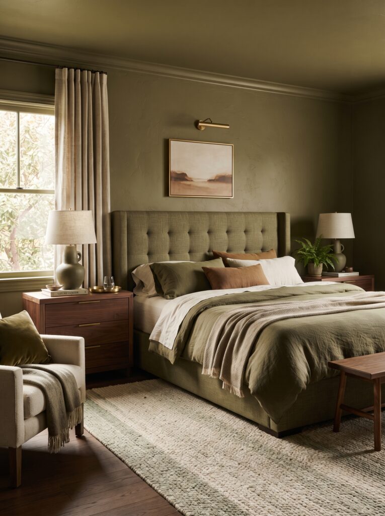
The result is an immersive bedroom that feels intentional, sophisticated, and surprisingly cozy.
Color-drenched bedrooms can work with almost any style. Depending on the shade you choose, the look can feel modern, traditional, romantic, moody, earthy, minimalist, or luxurious. The technique is especially useful when you want your bedroom to make a strong visual statement without filling it with lots of accessories.
If you are looking for bedroom decor ideas that feel more sophisticated than a standard accent wall, these color-drenching ideas can help you create a warm designer-inspired bedroom at home.
What Is Color Drenching?
Color drenching is an interior decorating technique where one dominant color or a closely related group of tones is used across multiple surfaces in a room.
Instead of painting only the four walls, the color may continue onto:
- Ceiling
- Baseboards
- Door frames
- Doors
- Built-in shelving
- Window trim
- Architectural details
- Selected furniture
The purpose is to create a continuous visual effect.
For example, imagine a bedroom with deep olive-green walls, matching trim, an olive-toned ceiling, warm green bedding, and dark wood furniture. Rather than seeing each element separately, your eye experiences the room as one cohesive environment.
This can make the bedroom feel more intentional and visually enveloping.
Why Color Drenching Works So Well in Bedrooms
Bedrooms are naturally suited to immersive color schemes because they are spaces associated with comfort and relaxation.
Unlike kitchens and living rooms, bedrooms do not necessarily need to feel bright and energetic all the time.
Deep, muted, and earthy colors can create a cocoon-like atmosphere.
Even lighter colors can become more sophisticated when they are repeated throughout the room.
Color drenching can also make architectural features feel more integrated. Painting trim, doors, and walls in the same color reduces visual interruptions and creates a smoother appearance.
The result can feel surprisingly luxurious without requiring expensive furniture.
1. Olive Green Color-Drenched Bedroom
Olive green is a beautiful choice if you want a bedroom that feels natural, calm, and sophisticated.
Instead of using a bright green, choose a muted olive or earthy sage shade.
Carry the color across the walls and trim, then introduce slightly different green tones through bedding and textiles.
Pair the color with:
- Walnut furniture
- Cream linen bedding
- Brass lighting
- Natural fiber rugs
- Ceramic accessories
- Soft beige curtains
The combination creates a warm, organic atmosphere that feels connected to nature.
For a more modern look, keep the furniture simple and the accessories minimal.
2. Deep Blue Bedroom
Deep blue can create an elegant and atmospheric bedroom.
Consider shades such as navy, ink blue, or muted blue-gray.
A fully blue room can feel dramatic, but balancing it with warm materials prevents it from becoming too cold.
Natural wood is particularly effective with deep blue.
Add cream bedding, warm lamps, woven textures, and subtle brass details to create contrast.
If the bedroom receives limited natural light, consider using a slightly softer blue rather than an extremely dark shade.
The goal is to create depth without making the room feel visually heavy.
3. Warm Terracotta Color Drenching
For a bedroom with an earthy and welcoming personality, terracotta can be an excellent choice.
Terracotta shades range from soft clay to deeper burnt orange.
Use a muted version rather than an extremely bright orange if you want an elegant look.
Pair terracotta walls with:
- Natural wood
- Ivory bedding
- Cream curtains
- Woven baskets
- Neutral rugs
- Aged brass
- Handmade ceramics
This color combination can make the bedroom feel warm and inviting, particularly during fall and winter.
4. Chocolate Brown for a Cozy Bedroom
Brown has become increasingly popular in interiors because it adds warmth and depth without the intensity of black.
A color-drenched chocolate or espresso bedroom can feel intimate and luxurious.
If you choose a dark brown, introduce lighter elements such as cream bedding and soft beige textiles.
Wood furniture can also work beautifully, although you should vary the wood tones slightly so that everything does not blend together.
For example, a dark brown wall can be paired with medium walnut furniture and light oak accents.
The different textures and tones keep the room visually interesting.
5. Soft Beige for a Minimalist Bedroom
Color drenching does not have to mean using a dramatic color.
Soft beige, warm ivory, mushroom, and taupe can create an understated monochromatic bedroom.
This approach is particularly effective if you prefer a quiet luxury aesthetic.
Use one warm neutral across the walls and trim, then layer different textures through:
- Linen
- Boucle
- Wool
- Cotton
- Natural wood
- Stone
- Ceramic
Because the colors are subtle, texture becomes the main source of visual interest.
The result can feel calm, sophisticated, and timeless.
6. Dusty Rose for a Sophisticated Bedroom
Pink does not have to look overly feminine or childish.
Muted dusty rose, clay pink, and warm blush can create a refined bedroom when paired with the right materials.
Use a dusty rose shade across the walls and trim, then balance it with:
- Walnut wood
- Cream textiles
- Aged brass
- Natural stone
- Warm white lighting
Avoid using too many bright pink accessories.
The more sophisticated approach is to let the wall color provide most of the personality while keeping the rest of the room restrained.
7. Moody Charcoal Bedroom
If you love dramatic interiors, charcoal can create a beautiful cocoon-like bedroom.
Instead of pure black, choose a softer charcoal with warm undertones.
Use the shade across the walls and trim, then introduce lighter bedding and natural textures.
Cream, camel, taupe, and warm wood work especially well.
Large windows can help balance the darker color during the day, while warm bedside lighting can create an intimate atmosphere at night.
8. Use the Ceiling as Part of the Design
One of the most distinctive aspects of color drenching is extending the color onto the ceiling.
Many bedrooms have white ceilings by default, which creates a strong visual boundary between the walls and ceiling.
Painting the ceiling in the same or a closely related shade removes that boundary.
This can create a more immersive feeling.
In a smaller bedroom, however, test your chosen color carefully before committing. Dark colors may create a dramatic effect, while lighter tones can maintain a more airy appearance.
The best choice depends on the room’s natural light, ceiling height, and overall design.
9. Paint the Trim Instead of Keeping It White
White trim is common, but it is not the only option.
Painting the baseboards, door frames, and window trim in the same color as the walls can make a bedroom feel much more cohesive.
This is especially effective with:
- Deep green
- Navy
- Chocolate brown
- Warm beige
- Dusty rose
- Muted clay
Matching trim also allows architectural features to blend into the overall design rather than visually interrupting the room.
10. Match Your Bedroom Door
For an even more immersive effect, paint the interior bedroom door in the same shade as the walls.
This small detail can make a surprisingly large difference.
Instead of having a white door stand out, the doorway becomes part of the color story.
This technique works particularly well in bedrooms with built-in closets or architectural niches.
11. Choose Bedding That Supports the Color
You do not need perfectly matching bedding.
In fact, using slightly different shades usually creates a more sophisticated look.
For example, in an olive-green bedroom you could use:
- Cream sheets
- Sage duvet
- Olive throw
- Beige pillows
- Natural linen accent cushions
The colors relate to one another without looking overly coordinated.
The same principle works with blue, brown, beige, and terracotta bedrooms.
Think tonal rather than identical.
12. Introduce Contrast Through Wood
Natural wood is one of the easiest ways to balance a color-drenched room.
Wood adds warmth and breaks up large areas of painted color.
Walnut works beautifully with:
- Olive
- Navy
- Cream
- Terracotta
- Dusty rose
Lighter oak can create a softer appearance with beige, sage, and muted colors.
Choose furniture with visible natural grain whenever possible. The texture helps the bedroom feel more layered.
13. Use Lighting to Change the Mood
Lighting becomes especially important in a color-drenched bedroom.
The same paint color can look completely different under daylight, warm lamps, and cool overhead lighting.
For a cozy atmosphere, use multiple light sources instead of relying on one bright ceiling fixture.
Consider:
- Bedside lamps
- Wall sconces
- Floor lamps
- Accent lighting
- Warm LED bulbs
Layered lighting creates depth and allows you to change the mood throughout the day.
14. Add Natural Textures
A room with one dominant color can benefit from plenty of tactile variation.
Introduce:
- Linen
- Wool
- Rattan
- Jute
- Boucle
- Cotton
- Wood
- Stone
- Ceramic
For example, a deep green bedroom with smooth painted walls can be softened with linen bedding, a woven rug, a wooden nightstand, and a textured throw.
The combination keeps the room from feeling flat.
15. Keep Artwork Simple
Color-drenched rooms already have a strong visual identity.
You do not need a large gallery wall.
Instead, consider one or two carefully selected pieces.
Neutral artwork can provide a quiet contrast against colorful walls.
Black-and-white photography can create a more modern feel.
Abstract artwork with related tones can reinforce the color palette.
The important thing is to avoid adding so many competing colors that the original color-drenching effect disappears.
16. Use Mirrors Carefully
A mirror can help reflect light and create visual depth.
In a darker color-drenched bedroom, a large mirror can prevent the space from feeling too enclosed.
Choose a frame that complements the room.
Wooden frames work well with earthy palettes.
Brass can add elegance.
Simple black frames can create a more contemporary look.
Avoid using too many mirrors simply for decoration. One thoughtfully positioned mirror is usually enough.
17. Create a Tonal Bedroom
One of the easiest ways to make color drenching look sophisticated is to build a tonal palette.
Instead of choosing one exact shade and repeating it everywhere, use several variations of the same color.
For example:
Green palette
Deep olive + sage + moss + cream
Brown palette
Chocolate + walnut + camel + ivory
Blue palette
Navy + dusty blue + blue-gray + cream
Beige palette
Taupe + sand + warm white + mushroom
This approach gives the bedroom depth while maintaining a cohesive appearance.
18. Color Drenching in a Small Bedroom
Many people assume that dark colors should never be used in small bedrooms.
That is not necessarily true.
A small room can actually benefit from an immersive color scheme because the continuous color can make the boundaries of the room feel less visually fragmented.
Instead of highlighting every corner, the eye experiences the room as one environment.
If you are concerned about the space feeling too dark, choose a mid-tone color and incorporate plenty of warm lighting and lighter textiles.
19. Color Drenching a Guest Bedroom
A guest bedroom is an excellent place to experiment with a more distinctive color.
Since guests typically use the room temporarily, you can create a stronger design statement without worrying about personal preferences as much as you might in a primary bedroom.
Muted green, warm beige, dusty blue, and soft clay are versatile choices.
Keep the bedding comfortable and the styling relatively simple.
A guest bedroom should feel beautiful but also welcoming.
20. Color Drenching a Bedroom on a Budget
You do not need to purchase all new furniture to create this look.
Start with paint.
Changing the wall color and trim can already make a major difference.
Then work with the furniture you have.
You can update the room through:
- New bedding
- A textured throw
- New lampshades
- Secondhand furniture
- DIY painted nightstands
- Affordable curtains
- Simple artwork
- Decorative pillows
The goal is to create visual cohesion rather than replace everything.
21. How to Choose the Right Color
Before selecting a paint color, observe the bedroom throughout the day.
Notice:
- How much natural light enters
- Which direction the windows face
- Whether the room receives morning or afternoon sunlight
- The color of the flooring
- Existing furniture tones
- The color of adjacent rooms
Paint samples can look very different under different lighting conditions.
Test your preferred colors on several walls and observe them during both daytime and evening.
This is particularly important with complex colors such as olive, taupe, clay, blue-gray, and brown.
22. Avoid Making Everything Identical
Color drenching does not mean buying everything in exactly the same shade.
If the walls, curtains, bedding, furniture, rug, and accessories all match perfectly, the room can look flat.
Instead, use tonal variation.
Let the walls be the dominant color and allow furniture, textiles, and accessories to provide subtle differences.
This makes the room feel collected rather than manufactured.
23. Combine Color Drenching With Quiet Luxury
If you prefer an elegant, expensive-looking bedroom, combine color drenching with restrained styling.
Choose:
- High-quality-looking fabrics
- Natural wood
- Simple silhouettes
- Minimal accessories
- Warm lighting
- Neutral artwork
- Subtle metal accents
Avoid filling the room with decorative objects.
A few beautiful pieces usually have more impact than many inexpensive-looking accessories.
24. Common Color-Drenching Mistakes
Choosing a Color Without Considering Lighting
A shade that looks beautiful online may look completely different in your bedroom.
Using Too Many Competing Colors
A dominant color needs supporting tones rather than numerous unrelated shades.
Forgetting the Ceiling
If you want a fully immersive effect, consider whether the ceiling should be included.
Using Only One Texture
A monochromatic room needs textural variation.
Overdecorating
Let the color itself become part of the decoration.
Conclusion
Color drenching is one of the most effective ways to give a bedroom a designer-inspired appearance without relying on excessive decoration.
Whether you choose earthy olive, deep blue, chocolate brown, warm beige, dusty rose, or another sophisticated shade, the technique works by creating continuity throughout the space. Paint the walls and trim in related tones, consider extending the color to the ceiling, then introduce natural wood, layered bedding, warm lighting, and tactile textiles.
The result can be dramatic without feeling overwhelming, minimalist without feeling boring, and luxurious without requiring a complete bedroom makeover.
Most importantly, choose a color that makes you feel comfortable when you enter the room. A beautiful bedroom should not simply look good in photographs. It should feel calm, personal, and inviting every day.
Save these color-drenched bedroom ideas as inspiration for your next bedroom refresh and experiment with a tonal palette that reflects your own style.
- Luxury Bathroom Styling Ideas That Create a Spa-Like Feel
- Under-Stair Storage Ideas That Make Small Spaces Feel Organized
- Statement Ceiling Ideas That Transform an Ordinary Room
- Color-Drenched Bedroom Ideas for a Cozy Designer Look
- Kitchen Countertop Decor Ideas That Look Effortlessly Expensive