
Color has the power to completely transform the personality of a home. It can make a room feel calm and inviting, dramatic and sophisticated, cheerful and energetic, or warm and intimate. But instead of using one color only on a single accent wall, an increasingly interesting approach to interior design is to embrace the color across the entire room.
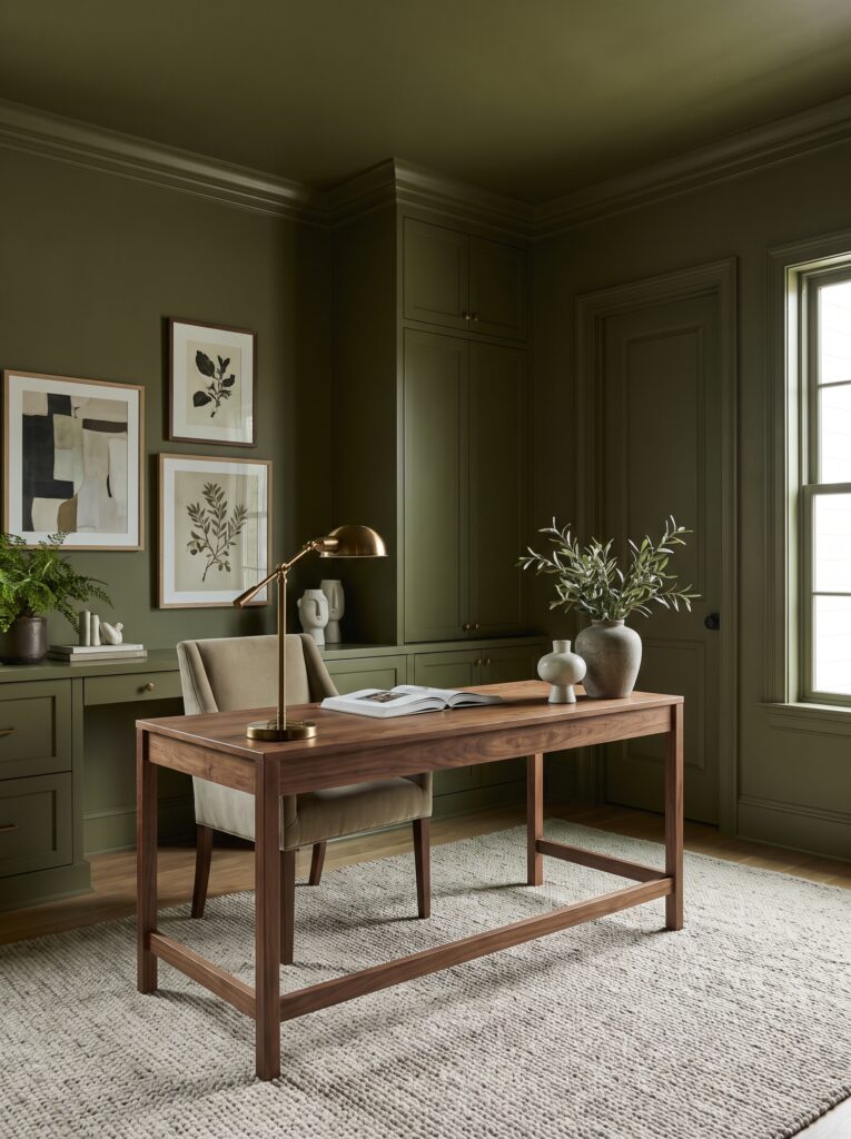
This decorating technique is known as color drenching.
Color drenching involves using one dominant color, or closely related shades of the same color, across multiple surfaces in a room. Walls, trim, doors, cabinetry, and sometimes even the ceiling can be painted in the same or similar tones. Rather than creating a traditional contrast between walls and trim, color drenching creates a more immersive and cohesive environment.
The result can be surprisingly sophisticated.
A small room can feel intentional and cozy. A large room can feel more enveloping. Architectural details can become more noticeable, while ordinary walls can take on a much stronger visual identity.
For homeowners in the United States who want to refresh their interiors without completely replacing their furniture, color drenching can be an effective way to create a dramatic transformation with paint and thoughtful styling.
What Is Color Drenching?
Color drenching is an interior decorating technique in which a single color is extended across several surfaces instead of being limited to one wall.
Traditional decorating often uses a combination such as white trim, a colored wall, and a contrasting ceiling.
Color drenching takes a different approach.
Imagine a room where the walls, doors, baseboards, window trim, built-in cabinets, and ceiling all share a similar muted olive green.
Instead of breaking the room into separate visual sections, the color creates one continuous environment.
This can make the architecture feel more cohesive and can give the room a distinctive personality.
Color drenching does not necessarily mean every surface has to use exactly the same paint color. You can use variations within the same color family to create subtle depth while maintaining the overall monochromatic effect.
Why Color Drenching Looks So Sophisticated
One reason color drenching can feel luxurious is that it reduces visual interruptions.
When walls and trim are dramatically different colors, the eye naturally notices the boundaries between surfaces.
When those surfaces are painted in similar tones, the boundaries become less obvious.
This creates a more seamless appearance.
The technique can also make architectural features feel more intentional.
Doors, moldings, built-ins, shelving, and window trim can blend into the overall composition instead of appearing as separate elements.
That makes the room feel more designed.
Another advantage is that color drenching can provide a strong backdrop for furniture and accessories.
Instead of competing with multiple wall colors, the room has one visual foundation.
Artwork, lighting, textiles, wood furniture, and decorative objects can then become the contrasting elements.
1. Start With a Sophisticated Color
The most important decision is choosing the right color.
Color drenching can work with almost any hue, but sophisticated and slightly muted colors are often easier to live with.
Consider shades such as warm olive, dusty blue, muted terracotta, chocolate brown, soft clay, deep taupe, warm cream, muted sage, or sophisticated charcoal.
Instead of selecting a color simply because it is currently popular, consider how it will interact with your home’s natural lighting.
A color that looks beautiful in a bright showroom can look completely different in a north-facing room or a space with limited natural light.
Always consider the direction of your windows and how the room looks throughout the day.
2. Color Drench the Walls and Trim
One of the easiest ways to try the technique is to paint the walls and trim in the same color.
For example, instead of pairing olive walls with white baseboards and door frames, paint both the walls and trim olive.
This immediately creates a more cohesive appearance.
The same approach works with navy, brown, cream, blue-gray, green, and many other colors.
If you are worried that the room will look too overwhelming, choose a relatively soft or muted shade.
You can then introduce contrast through furniture and accessories.
3. Don’t Forget the Doors
Interior doors are often overlooked when decorating.
But when doors are painted in the same color as the surrounding walls, they can become part of the architectural composition.
A deep green room with matching green doors can feel sophisticated and enveloping.
A warm cream room with matching doors can feel soft and serene.
A muted blue room with blue trim and doors can create a calming atmosphere.
This technique works especially well in older homes where doors and trim are already prominent architectural features.
4. Take the Color Onto the Ceiling
If you want to take color drenching to the next level, consider painting the ceiling.
Many homeowners automatically choose white ceilings.
While white is timeless, it is not the only option.
A ceiling painted in the same color as the walls can create a much more immersive atmosphere.
This is especially effective in bedrooms, libraries, dining rooms, home offices, and small powder rooms.
If the room is already dramatic, a ceiling in the same color can make the design feel intentional rather than unfinished.
For a softer effect, use a slightly lighter version of the wall color on the ceiling.
5. Try Color Drenching in a Small Room
Small rooms are excellent candidates for color drenching.
A compact powder room, home office, reading room, or hallway can become much more interesting when one color is allowed to cover the entire space.
Instead of trying to make every surface visually disappear, color drenching gives the room a strong identity.
A small room can feel like a jewel box.
This approach can be particularly effective in rooms where you want to make a bold design statement without affecting the rest of the house.
6. Use Color Drenching in a Home Office
Home offices often benefit from a strong visual identity.
Painting the walls, trim, built-in shelves, and doors in one sophisticated color can create a focused and cohesive workspace.
A muted olive green can work beautifully with walnut furniture and brass lighting.
A deep blue can create a classic library-inspired atmosphere.
A warm brown can produce a cozy, sophisticated environment.
Add artwork, books, ceramics, and natural textures to prevent the monochromatic palette from feeling flat.
7. Create a Moody Dining Room
Dining rooms are another excellent place to experiment with color drenching.
Because dining rooms are often used in the evening, deeper colors can create an intimate and atmospheric environment.
Consider deep olive, chocolate brown, muted burgundy, navy, or charcoal.
Paint the walls and trim in the same color, then introduce a natural wood dining table, upholstered chairs, warm lighting, and simple artwork.
A statement chandelier can provide another layer of visual interest.
The result can feel elegant and dramatic without requiring expensive furniture.
8. Transform a Bedroom With Monochromatic Color
Bedrooms are ideal for softer versions of color drenching.
Try muted blue, warm beige, sage, dusty rose, or soft clay.
Painting the walls and trim in the same shade can create a calm background for layered bedding and natural textures.
You can then introduce slightly lighter or darker versions of the same color through pillows, blankets, curtains, rugs, and artwork.
This creates depth without introducing too many competing colors.
9. Use Color Drenching With Built-In Cabinetry
Built-in cabinetry provides an excellent opportunity to create a seamless color-drenched design.
Instead of painting the walls one color and the cabinetry another, use the same color throughout.
For example, an olive home office can have olive walls and matching built-in shelving.
A blue dining room can feature blue cabinetry.
A warm cream kitchen can incorporate matching cream cabinetry and walls.
This makes the built-ins feel like part of the architecture rather than separate furniture.
10. Add Contrast Through Texture
One potential problem with monochromatic decorating is that everything can begin to look flat.
The solution is texture.
If the walls are painted olive, introduce linen, wood, wool, ceramic, stone, metal, and glass.
If the room is drenched in warm cream, use boucle, natural oak, woven materials, plaster, and textured fabrics.
The color creates unity while the materials create depth.
This is one of the most important principles for making monochromatic interiors feel sophisticated.
11. Mix Different Finishes
You can also create visual interest by using different paint finishes on different surfaces.
For example, walls might use a matte or low-sheen finish while trim receives a slightly different finish.
This allows light to interact differently with each surface even though the color remains consistent.
The result is subtle rather than dramatic, which is ideal for elegant interiors.
Always follow the paint manufacturer’s recommendations for the appropriate finish for each surface.
12. Pair Color Drenching With Natural Wood
Natural wood is an excellent contrast to saturated or muted painted interiors.
Imagine a room drenched in deep olive with a warm oak table.
Or a soft blue room with walnut furniture.
Or a chocolate brown room with light oak accents.
The natural variation in wood grain prevents the space from feeling overly uniform.
Wood also introduces warmth and organic texture.
This is particularly effective for American homes where transitional, organic modern, and modern traditional styles remain popular choices.
13. Use Metallic Accents Carefully
Metallic finishes can add a sophisticated contrast to a color-drenched room.
Brass, bronze, blackened metal, and aged finishes can all work beautifully.
However, restraint is important.
You do not need metallic details everywhere.
A brass chandelier, a pair of brass lamps, or a few small hardware details may be enough.
The purpose is to create points of contrast rather than turn the room into a collection of shiny surfaces.
14. Color Drenching With Artwork
Artwork can become particularly powerful against a monochromatic wall.
A deep green wall can provide a dramatic backdrop for warm-toned artwork.
A cream room can showcase colorful abstract paintings.
A blue room can beautifully frame black-and-white photography.
When choosing artwork, think about contrast.
You want the artwork to stand out against the wall while still contributing to the overall color story.
15. Create a Sophisticated Olive Green Room
Olive green is an especially versatile choice for color drenching.
It works beautifully with natural wood, brass, cream, brown, black, and warm white.
An olive green home office with matching walls, trim, and cabinetry can feel sophisticated and grounded.
A bedroom can use softer olive with cream bedding and natural textures.
A dining room can combine deep olive walls with walnut furniture and warm lighting.
Because olive sits between green and earthy neutrals, it can feel both colorful and surprisingly timeless.
16. Try Warm Brown for a Cozy Interior
Brown is another excellent choice for creating an enveloping atmosphere.
Warm chocolate, cocoa, coffee, and tobacco-inspired tones can make a room feel intimate and sophisticated.
Brown works especially well with cream upholstery, natural wood, brass, leather, and warm lighting.
A color-drenched brown study or dining room can have an almost boutique-hotel atmosphere.
The key is balancing the depth of the color with sufficient lighting and lighter textures.
17. Use Blue for a Calm Monochromatic Space
Blue can create a peaceful and elegant interior.
Muted blue-gray works beautifully in bedrooms and bathrooms.
Deeper navy can create a dramatic dining room or home office.
Dusty blue can create a softer atmosphere.
Pair blue walls with natural wood, cream fabrics, antique brass, or warm white accents.
Avoid introducing too many unrelated colors.
Keeping accessories within a limited palette will help maintain the immersive quality of the design.
Color Drenching Ideas for Different Home Styles
Modern Home
Use a clean, sophisticated shade across walls, trim, and doors.
Keep furniture streamlined and accessories minimal.
Traditional Home
Try deep green, muted blue, warm taupe, or rich brown.
Combine the color with classic molding, traditional furniture, artwork, and brass details.
Transitional Home
Choose a sophisticated neutral or muted color.
Mix modern furniture with traditional architectural details.
Organic Modern Home
Use earthy colors such as olive, clay, warm beige, muted brown, or soft sage.
Combine them with natural wood, stone, linen, ceramics, and greenery.
Eclectic Home
Use a stronger color and introduce artwork, vintage furniture, unusual accessories, and collected objects.
How to Make Color Drenching Work in an American Home
The most successful color-drenched interiors do not rely on paint alone.
The surrounding furniture and materials matter.
If your home already contains warm wood floors, choose a color that works with those undertones.
If you have cool marble, select colors that complement rather than clash with it.
Consider existing countertops, flooring, cabinetry, hardware, furniture, and lighting before choosing your paint.
This is especially important in open-concept American homes where one room often visually connects to another.
You do not necessarily need to color drench every connected room.
Instead, choose one room where you want to create a stronger statement.
A dining room, office, bedroom, powder room, or reading room can become the perfect place to experiment.
Common Color Drenching Mistakes to Avoid
One of the biggest mistakes is choosing a color without considering natural light. A shade can look completely different in morning sunlight, afternoon light, and artificial evening lighting. Always test your color in the actual room before committing to the entire space.
Another common mistake is choosing a color that is too bright or intense without balancing it with softer materials. Saturated colors can be beautiful, but they may require more careful styling.
It is also possible to create a flat-looking monochromatic room if every surface has exactly the same texture and finish. Introduce wood, stone, linen, wool, ceramics, metal, and artwork to create dimension.
Finally, avoid adding too many unrelated accent colors. Color drenching works because it creates a cohesive visual story. A few carefully chosen contrasting elements are usually more effective than a rainbow of accessories.
How to Choose the Best Color for Color Drenching
Before selecting your final paint color, observe the room throughout the day.
Look at the walls in natural morning light.
Check the color again in the afternoon.
Then turn on your lamps and overhead fixtures in the evening.
Notice whether the color becomes warmer, cooler, darker, or more saturated.
Also consider the surrounding materials.
Warm wood tends to work well with earthy greens, creams, browns, and terracotta tones.
Cooler materials may work better with blue-gray, charcoal, soft green, or cooler neutrals.
The goal is to choose a color that feels beautiful throughout the entire day.
Color Drenching on a Budget
One of the most appealing aspects of color drenching is that you can create a significant visual transformation without replacing everything in the room.
Paint can dramatically change the appearance of walls, trim, doors, and built-ins.
Instead of purchasing an entirely new furniture collection, keep your existing pieces and update the background.
Add a few new textiles.
Replace outdated hardware.
Introduce one statement light fixture.
Bring in a new piece of artwork.
Add greenery and natural accessories.
These relatively small changes can work together to create a completely refreshed interior.
Is Color Drenching Timeless?
While specific paint colors will naturally change with decorating trends, the underlying concept of monochromatic design is not new.
Color drenching can be adapted to many different decorating styles and color palettes.
The technique becomes more timeless when you choose a color that genuinely suits your home rather than selecting a shade simply because it is currently popular.
A sophisticated olive, muted blue, warm cream, earthy brown, or soft taupe can remain attractive even as other trends change.
The furniture and accessories can also evolve over time while the painted architectural shell remains consistent.
Conclusion
Color drenching is a powerful way to make a home feel more intentional, immersive, and sophisticated without relying on complicated decorating schemes. By extending one carefully chosen color across walls, trim, doors, cabinetry, and even the ceiling, you can create a room with a strong visual identity and a beautifully cohesive atmosphere.
The technique works in everything from small powder rooms and cozy bedrooms to elegant dining rooms, home offices, libraries, and larger living spaces. The secret is not simply choosing a beautiful color; it is creating balance through texture, natural materials, thoughtful lighting, artwork, and carefully selected furniture. Whether you prefer muted olive, sophisticated blue, warm brown, earthy clay, soft cream, or another shade entirely, color drenching gives you an opportunity to make your home feel more personal and architecturally considered. If you are ready for a decorating change but do not want to replace everything in your room, painting the space from wall to trim may be the transformative update you have been looking for.
Save these color drenching ideas for your next home makeover and use them to create a room that feels cohesive, memorable, and effortlessly elevated.
- Afrohemian Dining Room Ideas for a Warm, Collected and Sophisticated Home
- Warm Wood and Black Kitchen Ideas for a Timeless Designer Look
- Small Reading Nook Ideas That Turn Forgotten Corners Into a Cozy Luxury Retreat
- Curated Trinket Shelf Ideas: How to Create a Collected and Personal Home
- Neo Deco Entryway Ideas That Make Your Home Feel Instantly Expensive